ART DIRECTION & DESIGN_RE-BRANDING CAMPAIGN
JUNE SHINE
HARD KOMBUCHA
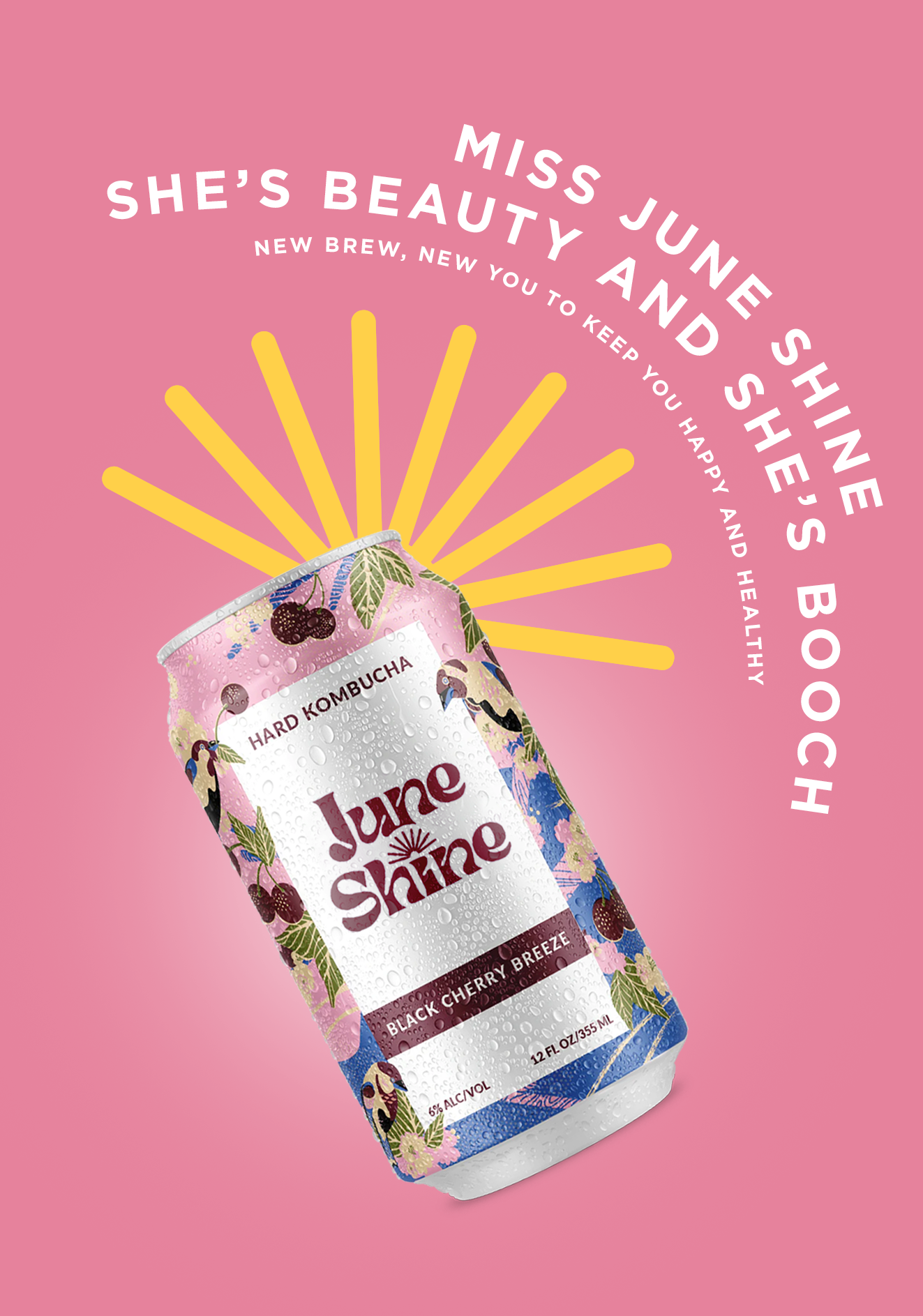
THE CHALLENGE |
Rebrand June Shine’s new logo to reflect the companies playful and bold aesthetic.
INSIGHT |
The true beauty of this delicious beverage is that its the new healthy alternative to enjoy oneself and also stay fit with natural ingredients and no artificial sweeteners.
SOLUTION |
To pair with the bright, bold spirit of June Shine, the logo was rebranded to reflect it’s beautiful personality.


Pivoting from the simplicity of their current logo, a new design was implemented with a curvier and more playful style.
June Shine is known to work with various artists and illustrators. Rotating artists will compliment limited release flavors. The new logo also helps to reflect these various artistic styles.

OOH Print Ads | Reflecting the beauty of June Shine which caters to their main female clientele.
Colors are customizable to each limited flavor can they release, so the possibilities are endless.


Part of the new marketing includes specialty cans that change color when the weather is too hot, to remind you to grab a cold June Shine from the cooler and flip over to get that perfect tan.


