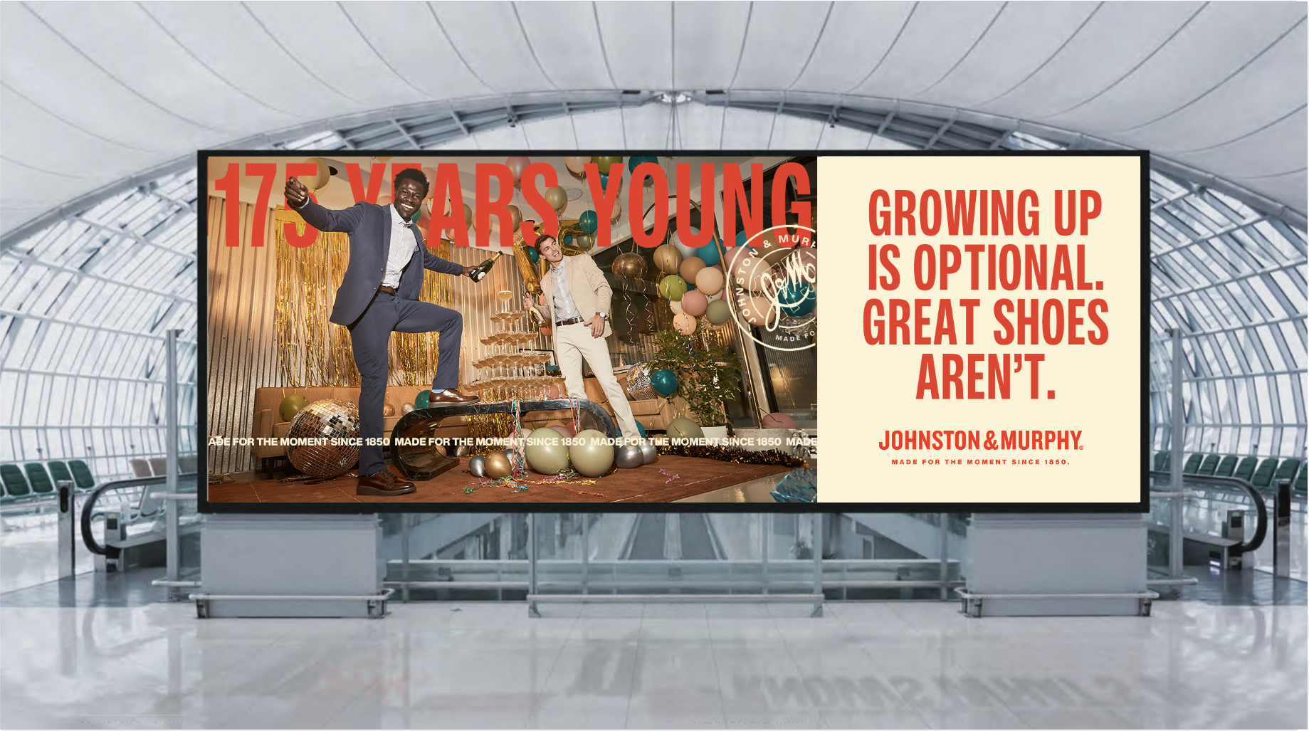
JOHNSTON & MURPHY: 175 YEARS YOUNG LOGO DESIGN
ART DIRECTION_GRAPHIC DESIGN_CONTENT CREATION
COPY | BEN BASHAW
CLIENT ASK |
In January 2025, J&M completed its 175th year in operation. To celebrate all year long they wanted an overarching campaign that could be utilized throughout their collection for spring/summer and fall/winter.
INSIGHT |
Brand anniversaries can suggest “being old”, but we can flip the script to make this a positive for our consumers.
SOLUTION |
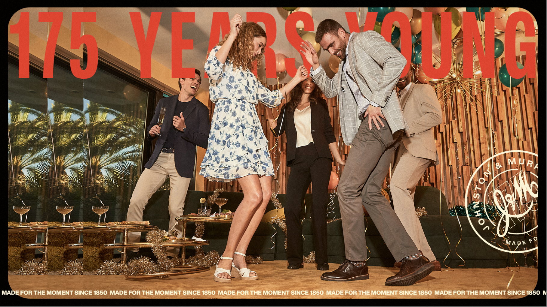
We chose the theme 175 Years Young, because we’re not old, we are just getting started.
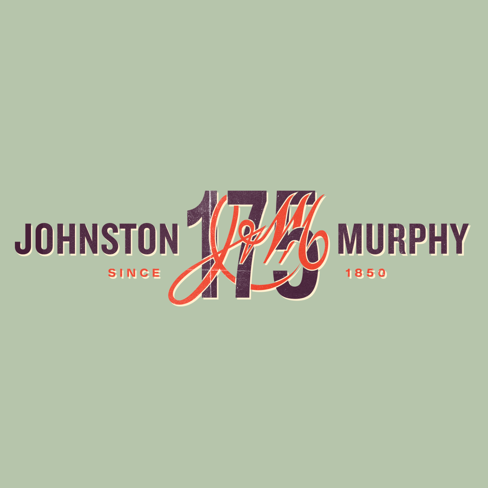
The Logo
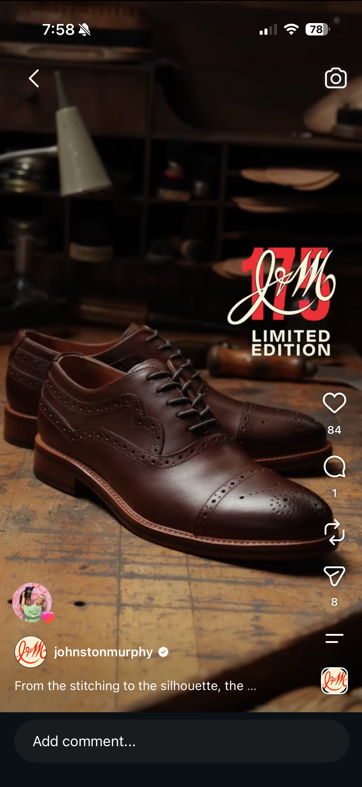
175 years is a big achievement. To show this we wanted the l75 to be bold and unapologetically striking.
The dimensionality of the layered numbers creates depth and visual interest with a modern and classic touch, typically seen in handmade lettering signs.
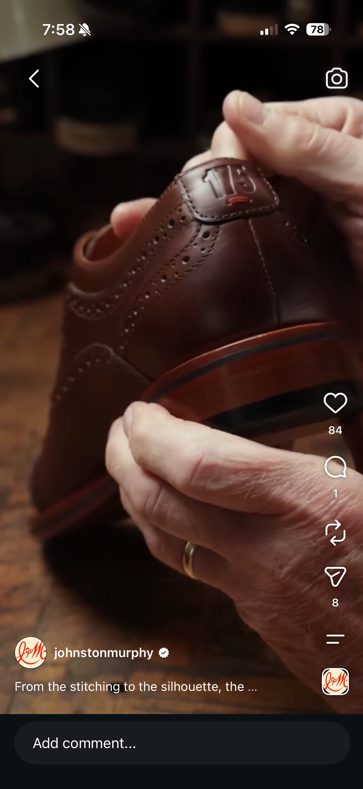
This craft and attention to detail gives a nod to J&M and their ethos of quality shoes that have lasted the test of time. Alongside the logo, the J&M script is integrated within the 175, which represents how J&M has been woven in the past one hundred and seventy five years. The clash of modern type with the classic J&M script nods to the evolving culture J&M has cultivated throughout these years. The variety of color options from the brand guide integrated with the logo gives way to many different looks and versatility.
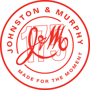


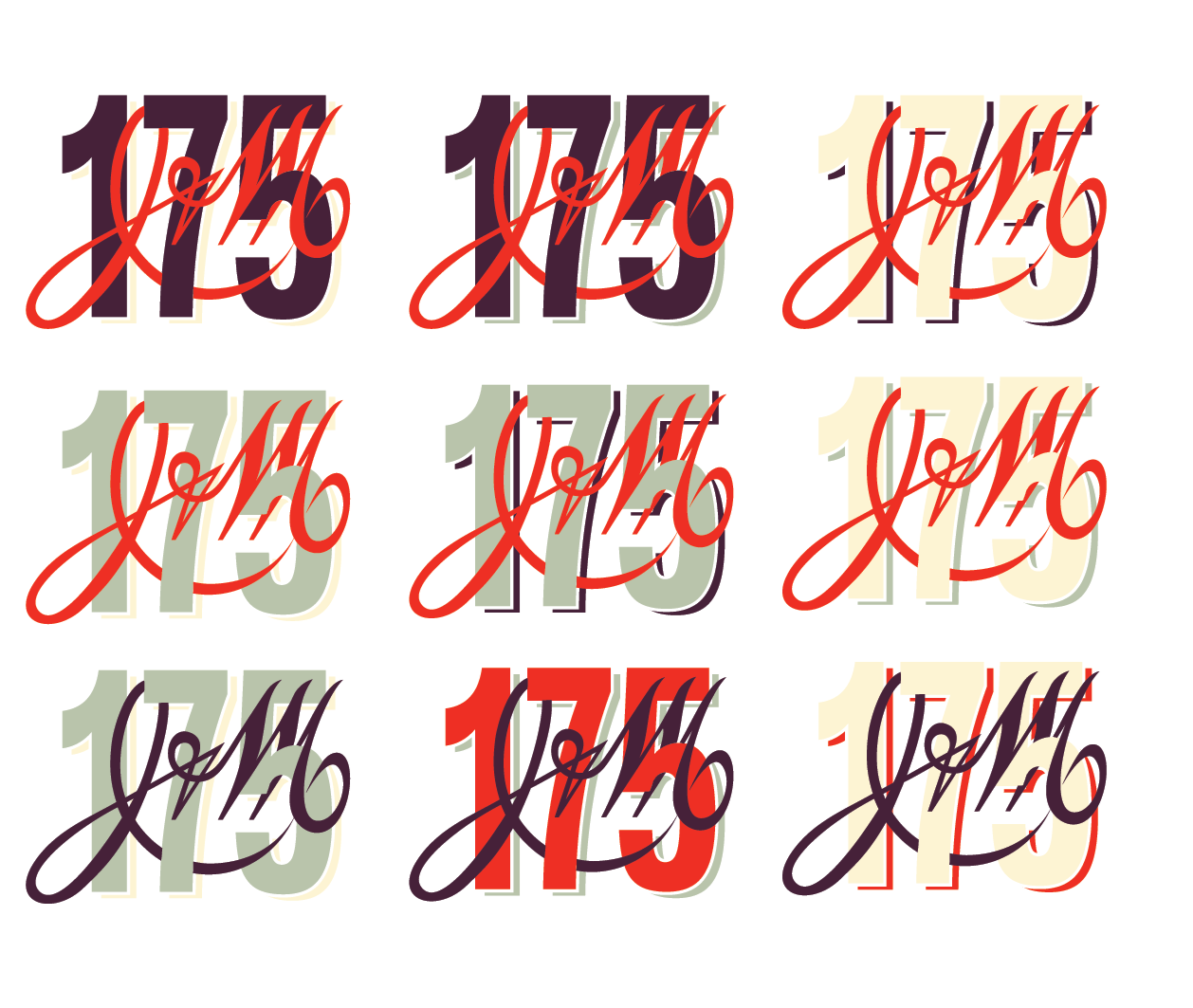
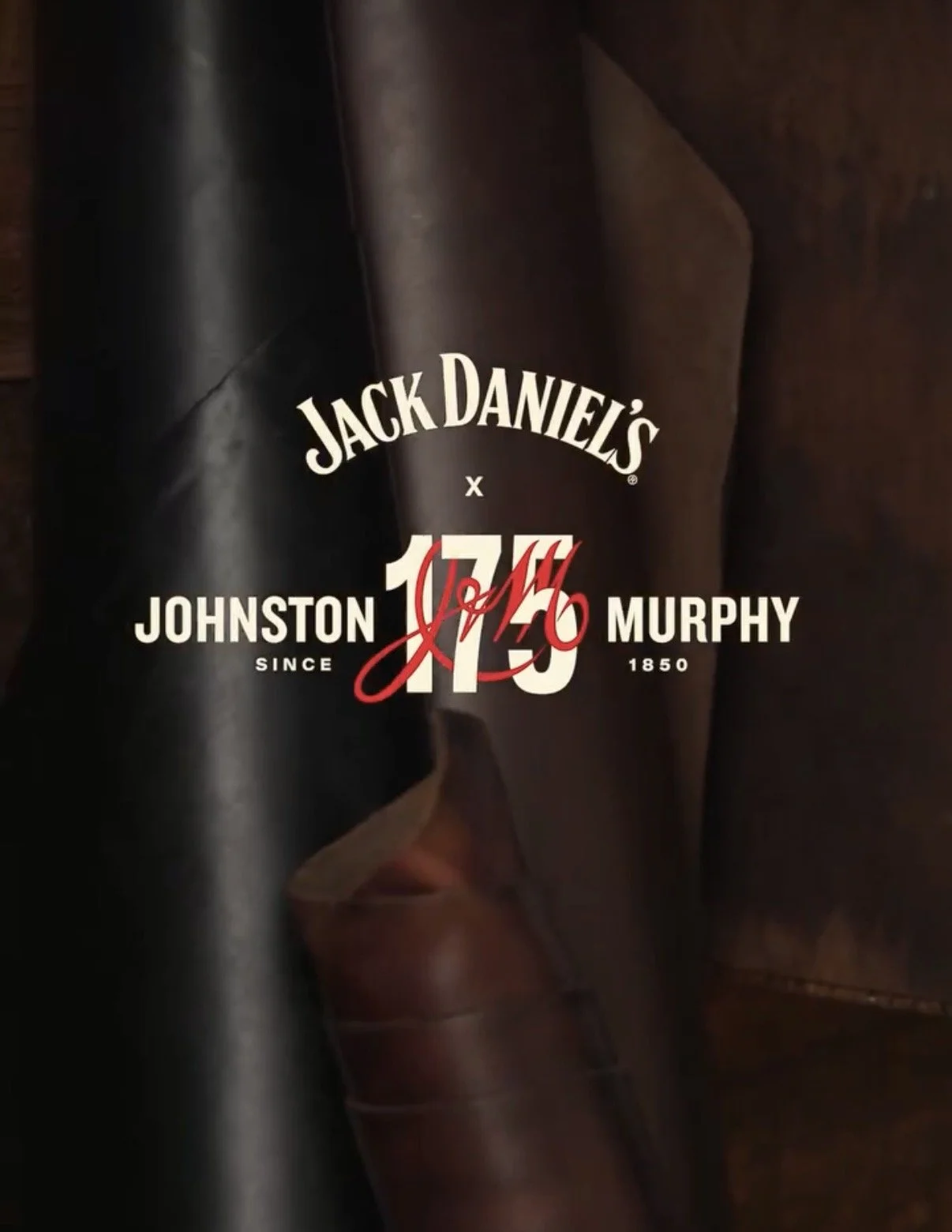
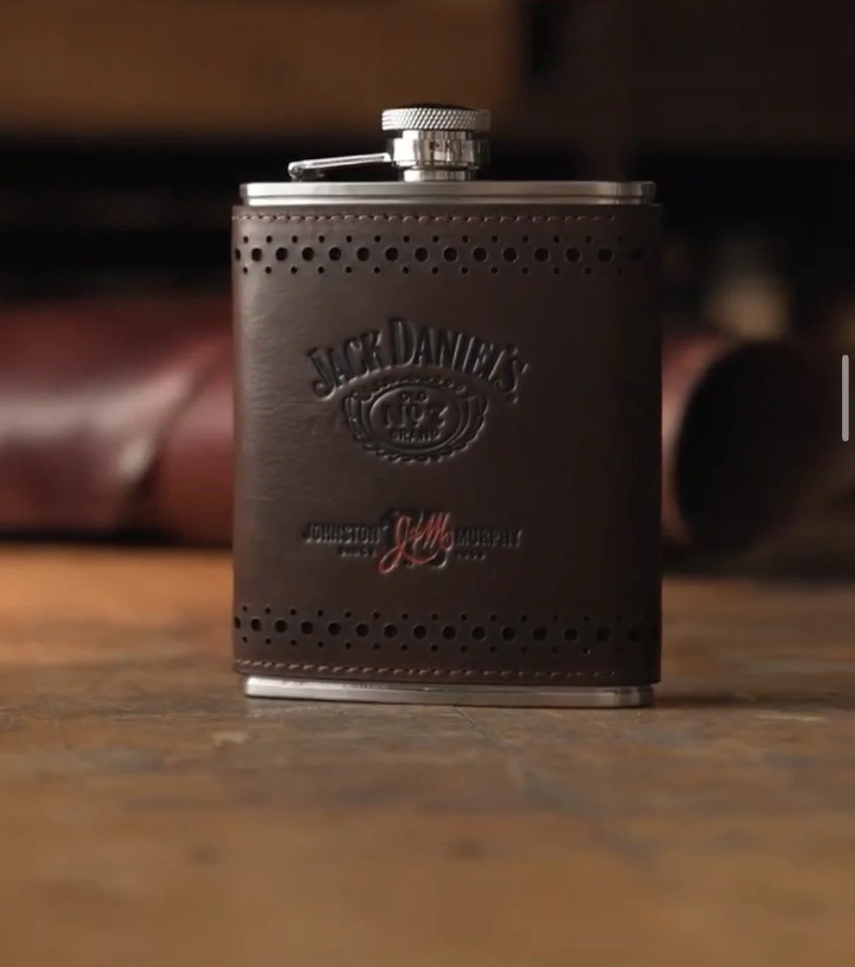
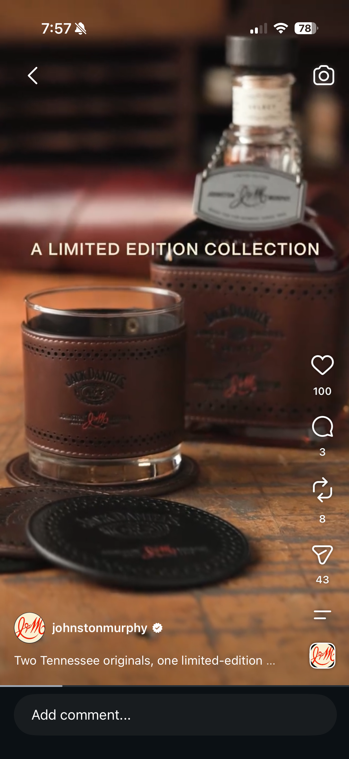
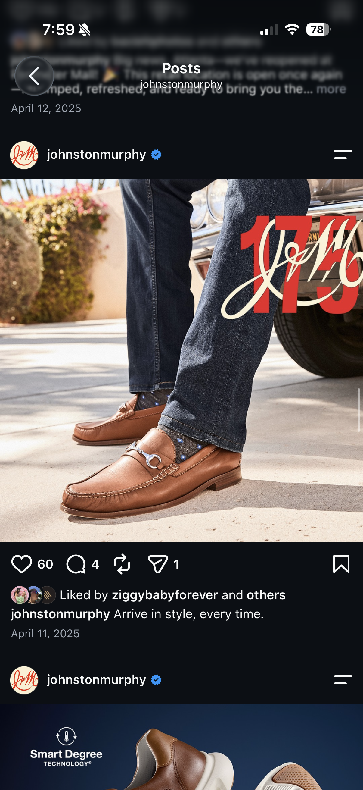
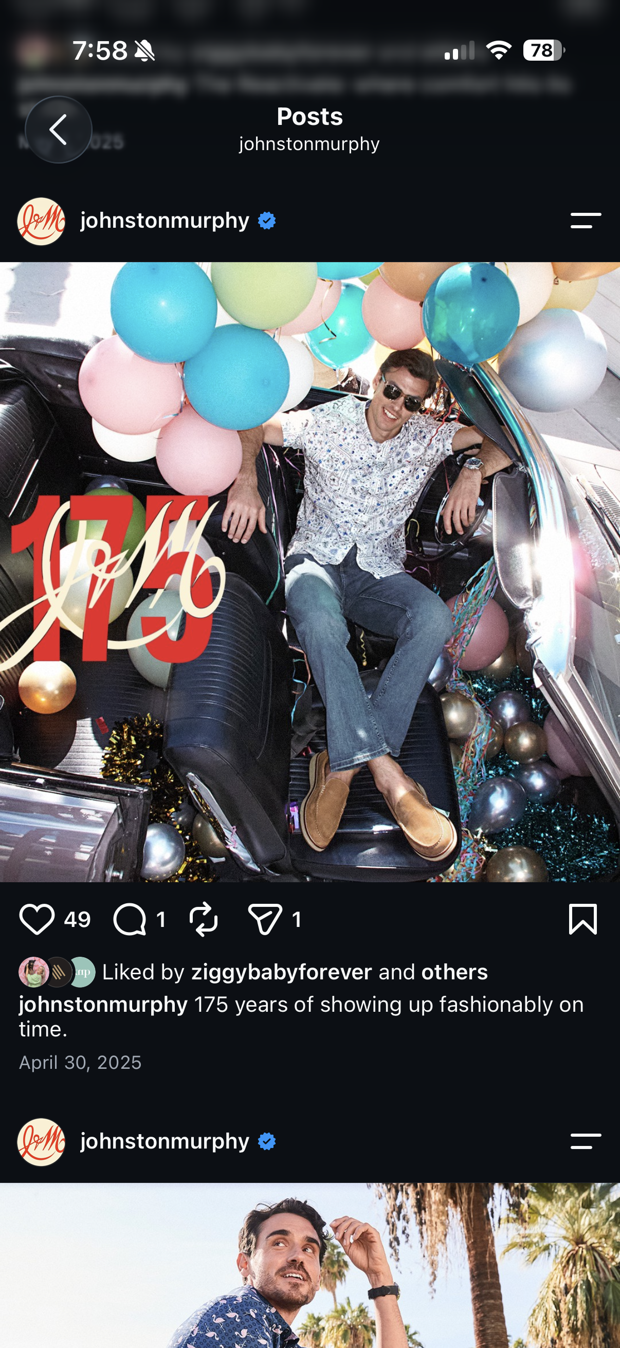
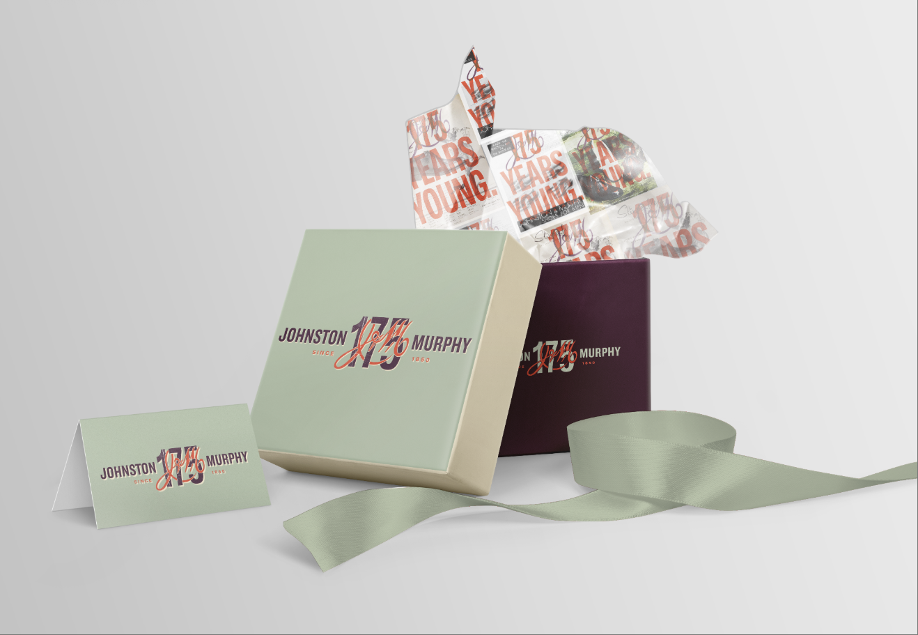
The 175th logo was used in a wide range of applications, from web, social, and video to product, as well as other brand collaborations.
Usage